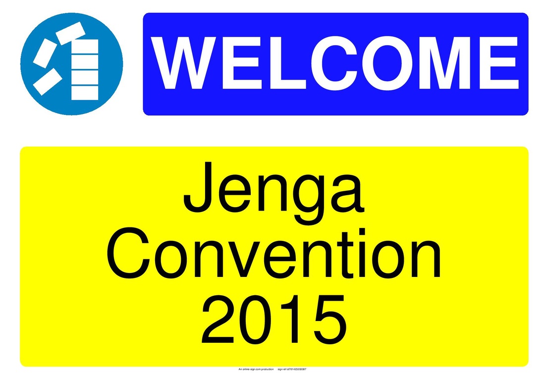
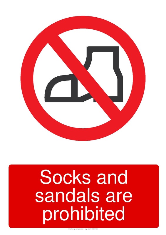
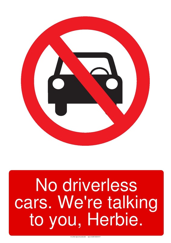
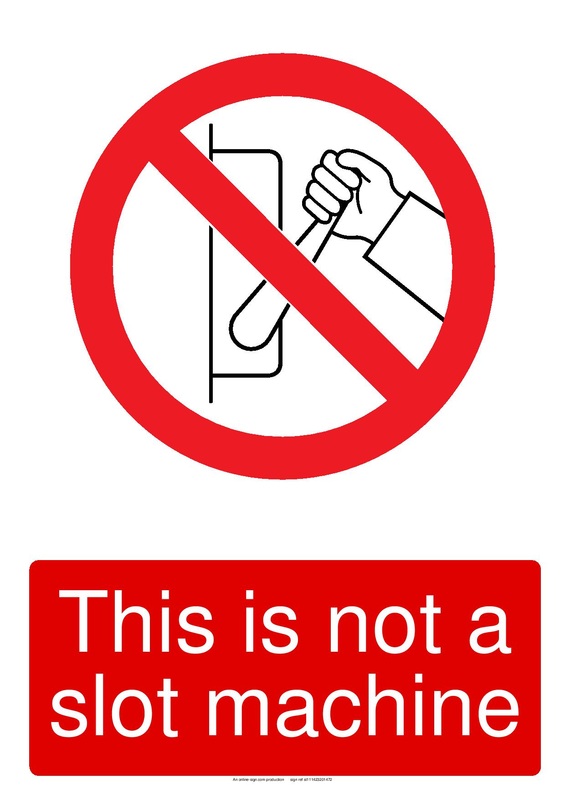
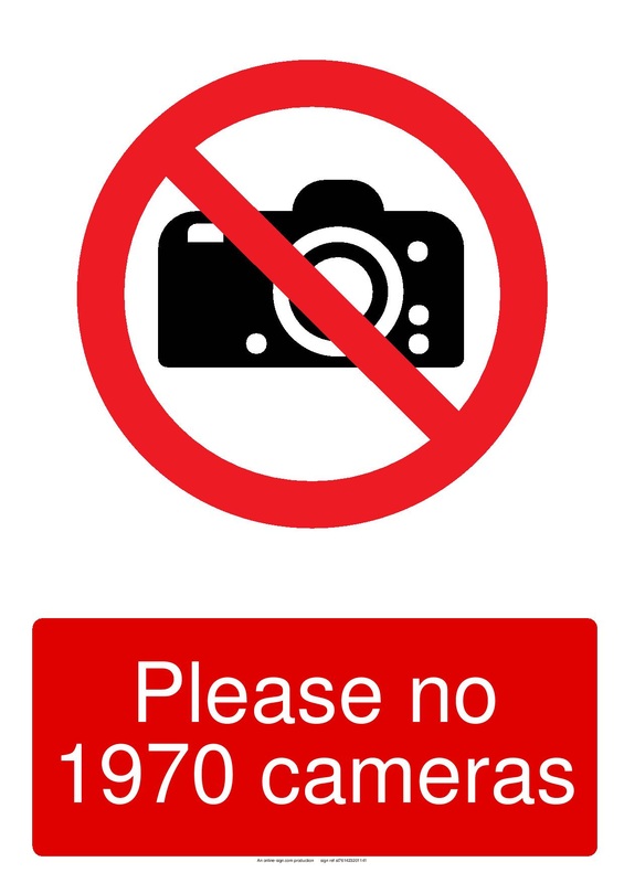
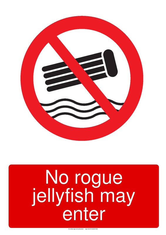
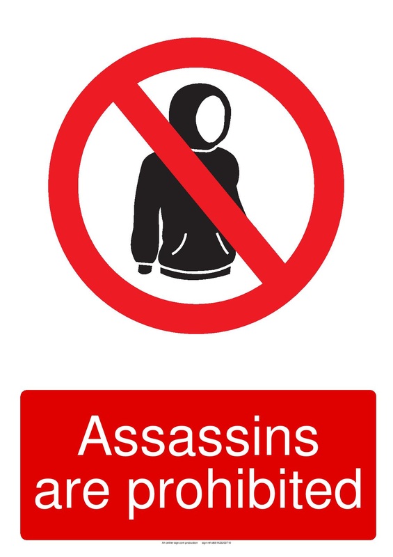
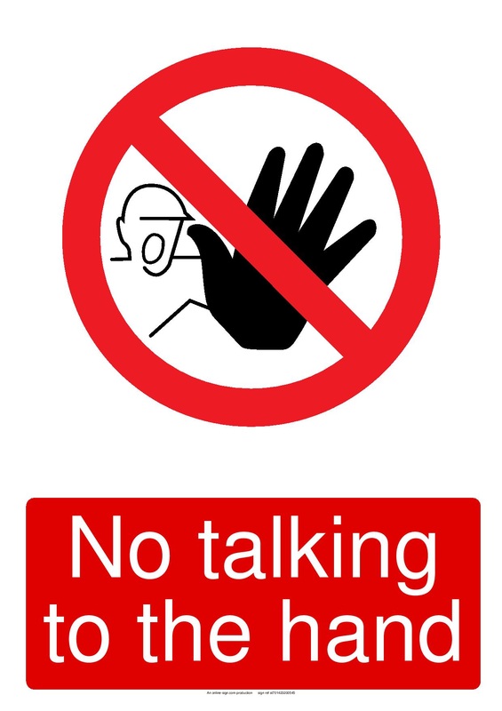
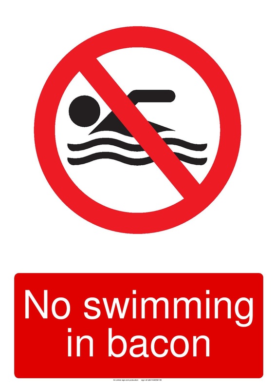
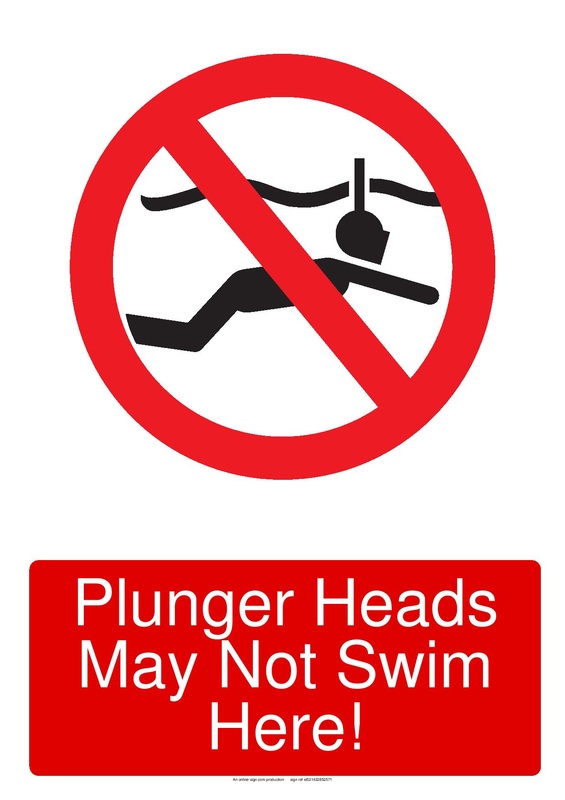
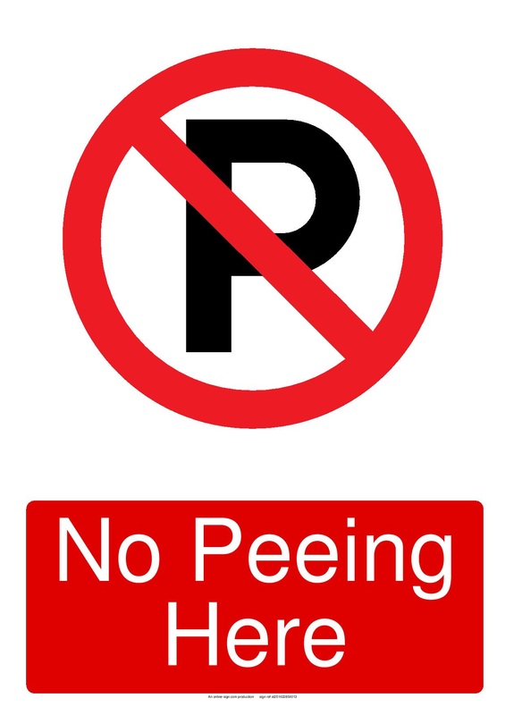
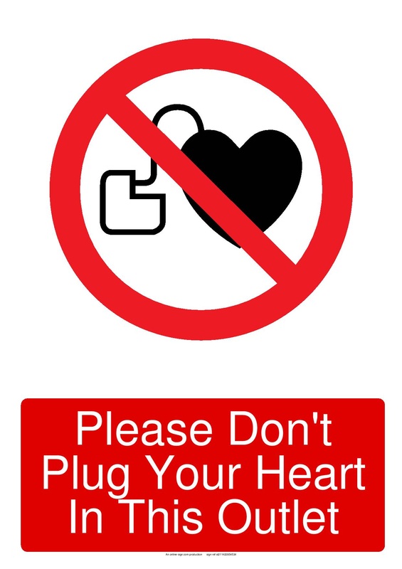
For the first of my three digital stories, I wanted to make a parody of warning signs. Although a lot of them are for safety or sanitary purposes, the art depicted on these signs are somewhat comical looking. So, my idea was to make light of something reasonably serious. I'm actually very happy with how they all turned out. I think they all look pretty believable visually (although not once they're read) and the satirical meaning I incorporated holds true to what they look like. The most challenging part was actually finding the right type of sign to play off of. The first sign I made was the "Jenga Convention" found below with a play on a "No stacking" sign I found online. After that initial creation, it was all about finding the right types of warning signs to use as a canvas. I decided signs with a red line through them looked the best visually, so 90% of my searching was done to put a sarcastic spin on their warnings. Some of them were easy to joke about (like swimming in bacon), but some of them were much harder to put a wise-crack hue to (like the No Cars sign that I related to Herbie the Love Bug. Although a direct story may not be in place, I feel there is definitely enough of a story held within the sarcastic captions found below each image.
 RSS Feed
